Table of contents
One of the things Link Digital is proud of is our ongoing collaboration with clients to improve or build on data management solutions we have developed together. A recent example is work with Living Lakes Canada on their Columbia Basin Water Hub, an award winning example of how open data can contribute to environmental conservation, freshwater stewardship, and community empowerment. Following the launch of the Water Hub, Link Digital joined the team to support the ongoing development of the site. Link Digital worked with the organisation to develop and implement a customised extension to improve the Water Hub’s data visualisation capabilities.
This article will discuss the CKAN extension, the collaboration process behind its development, and how it has enhanced the Water Hub’s visual presentation of data and improved how contributors and users interact with it.
The Columbia Basin Water Hub
Living Lakes Canada is a charitable water stewardship non-government organisation with over 20 years of experience working with community groups to protect freshwater. Their activities range from groundwater, lake, stream, and wetland monitoring to foreshore health assessments, biomonitoring for aquatic assessment and restoration, and water database development and management. The Columbia Basin Water Hub is their open data portal for freshwater data within the Columbia Basin, North America’s fourth largest freshwater basin.
The Water Hub was developed in response to the desire for a more coordinated water monitoring effort in the region, including the need to plug significant gaps in water data. Many local groups conduct water monitoring in the Basin, and their information was being held on private devices and, in some cases, even on paper, and was at risk of being lost. The Water Hub is designed to improve collaboration by helping the various stakeholders store and manage their data appropriately and effectively and make it freely accessible and usable.
Launched in March 2021, the Water Hub incorporates a CKAN instance, and includes customised features such as enhanced access and controls to maximise data sovereignty and adhere to OCAP® (Ownership, Control, Access, Possession) principles. It supports images and videos as dataset resources, and metadata schema and user experience enhancement are configured to optimize data discoverability and access.
Why was enhanced data visualisation necessary?
Link Digital has since been involved in ongoing support and maintenance of the Water Hub. One of the issues flagged by Living Lakes during this time were problems with the existing out-of-the-box CKAN graphing tool, particularly when it comes to showing data based on dates.
This makes the data hard to understand,
said Lex du Plessis, Link Digital’s Technical Delivery Manager.
Other feedback was that any time somebody starts working with the data to visualise something in a graph form, they find it is easier to download the dataset and do it in Excel, undertake whatever graphing work they need to, take screenshots of this and then reload these into CKAN, because it was just too hard to do a good graph in CKAN.
The need to be able to upload and showcase data in one space was the impetus behind developing a customised graphing extension. The ability to make water-related data viewable in visual formats also makes it easier to digest and enables users to draw quicker insights, including long-term trends and patterns which, in turn, enhances decision making regarding fresh water management. It can also enable more effective stakeholder communication and collaboration by making real time water-related data more accessible to a wider range of groups.
At first we tried to reconfigure the existing out of the box CKAN graphing tool,
said du Plessis.
But when this didn’t work and we realised the existing tool was basically not fit for purpose, we decided to reinvent it. We developed an entirely new extension, ckanext-charts, now being used in the Hub.
Benefits of the new graphing extension
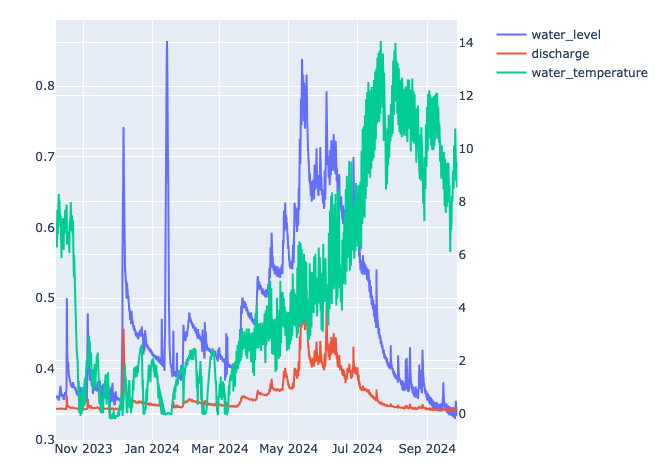
The extension enables users to easily generate interactive and visually appealing charts to enhance data analysis and presentation, by allowing them to create, manage, and visualize data stored in CKAN datasets.

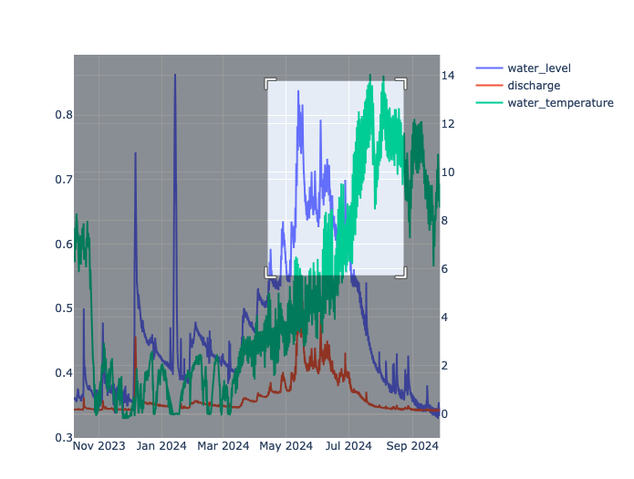
Let’s take an example relevant to the Water Hub: water level, discharge and temperature over time for a dam. With the extension, a user can show all three as a graph. It also enables a user to zoom in on a particular time span and track it in granular detail. For example, if a user wants to focus in on two years of a large span of data for the dam, they overlay the two years across one another, with a red line tracking one year and a blue line tracking the other.

The extension also enables users to:
- Flip the axis of a graph to view the data in a different way.
- Present the data in different visual styles, such as a pie, bar or line chart.
- Embed a graph in a description of the dataset, to showcase it and make it more impactful.
- Set permission controls, so that the use of the extension could be restricted to only authenticated users.
The extension makes the Water Hub more interactive in the way it handles data.
It also has a very powerful backend, which means we have kind of future-proofed it a bit,
said du Plessis.
You can choose between three different plotting engines [the software component responsible for rendering or displaying graphic representations of data] and if one of the engines becomes deprecated, we can just slot another one in.
The new graphing tool has the potential to significantly enhance how our contributors and users interact with the Columbia Basin Water Hub,
said Maggie Finkle-Aucoin, GIS and Database Manager at Living Lakes Canada.
By providing access to improved visualization functions, users can better understand the data they collect and spot trends more easily. This is crucial not only for scientific analysis but also for communicating insights to broader audiences, including those without a scientific background. Visualizing data helps bridge the gap between raw information and meaningful narratives, making it a powerful tool for community engagement and decision-making.
Challenges in developing the graphing extension
The conversation with Living Lakes about their graphing data needs took about a year, followed by the actual product development which went for close to three months. During this conversation, Link Digital strove to understand the data that the tool needed to graph. For example, the water data was in different formats, because of the various ways the Water Hub collected it.
We had to make sure we understood all of them, and that the graphing tool could adapt to any data format, and that meant really understanding the data we are working with and being able to plot it. It was also important that we built the tool in such a way that it is flexible enough to do other things. It is very easy to build a tool that shows one graph. It is very hard to build a tool to show twenty graphs well. It is about making sure that your tool is not a one trick pony.
We’ve always found working with Link Digital to be a positive experience,
said Finkle-Aucoin.
Lex, our product owner over the past year, has consistently taken the time to understand our needs and work with us to develop solutions that best serve our community. I was especially impressed with how Link Digital integrated a year’s worth of discussions and insights into the development of the graphing tool. It showed a holistic approach to our platform, rather than a generic ‘one size fits all’ solution, which is crucial for addressing the specific needs of our users.
The graphing extension also comes with comprehensive documentation and support, to make it as easy to use as possible.
Link Digital working to make water data more usable and shareable
Link Digital’s custom designed ckanext-charts extension enables users to generate interactive and visually attractive charts from data they have collected. In the case of Columbia Basin Water Hub, this enables users to better understand the data they collect and spot trends more easily, making it a more effective tool for building community engagement and enabling better decision-making.
There is now considerable interest in the graphing extension from other organisations in Canada and elsewhere.
Read the case study: Columbia Basin Water Hub
Interested in better data visualisation?
Are you interested in making your data more interactive and visually appealing? If so, contact us and tell us about your project.


