This post was co-authored by Anastasiia Shevtsova, UI/UX Designer at Link Digital
Not surprisingly, perhaps, the focus for those building open data portals is often the hard tech and data-related aspects of the job; ensuring the datasets and metadata are high quality, that the site is interoperable, and that the other technological aspects are running smoothly – the nuts and bolts of effective data sharing.
But there is another vital aspect of the design and construction of open data portals that is often overlooked: the user experience (UX).
Even if your data is of the highest quality, poor UX can seriously hold back the discoverability, usability and reusability of the datasets on your portal. In short, you ignore it at your peril, regardless of the tech stack you are using.
Let’s look at the elements that make up good UX design and why it’s so important.
What is user experience?
The main purpose of UX informed design is building products that help people to complete their tasks easily and without frustration and unnecessary pain points. In the case of an open data portal, this is obviously helping people find, understand, download and use the data.
Taking UX design into consideration when building an open data portal entails the entire process, including design, useability and function.
Peter Morville, the founder of what is known as information architecture, proposed a UX Honeycomb consisting of seven principles for effective UX design: usefulness, desirability, accessibility, credibility, findability, usability and value, and impact. This encompasses posing questions during the design phase, such as: does the product solve the problem it was designed to address (usefulness); is it easy to navigate (usability); is it simple to navigate (findability); and does the design makes its accessible, regardless of factors such as physical status, age, gender and cultural background, etc (accessibility).
Balancing the competing needs of your data portal audiences
We have previously discussed the challenges of building open data platforms and associated data products that can speak to everyone. This can be a particular challenge when the proposed portal’s design parameters are set and monitored by people without design experience, or when the portal is being established in a bureaucratic or political context. For example, for a government client which may be keen to share data with the public but sees them as a passive consumer, rather than an essential stakeholder in the development process.
As Maeva Tesan, from the Pacific Data Hub and Pacific Community Centre for Ocean Science, noted in a recent interview on our site, too often the design of open data portals is “shaped [only] by the mindset of project managers, usually leaning toward the project management perspective,” especially when these portals deal with scientific data. This means that the tools and language can feel too complex for people without data experience.
Complexity is not only often necessary for many users in government or research circles, it is also their second nature. They require advanced features and functionality like advanced filtering, accessing APIs, geospatial tools, automating Digital Object Identifier registration, and the ability to handle very large datasets.
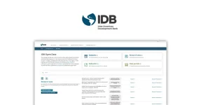
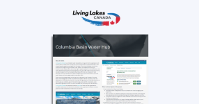
The solution is often to try and find a balance catering to the experts and catering to the wider public. One example,cited by Tesan, is the Climate Change Flagship, a site affiliated to the Pacific Data Hub. The design, done with Link Digital, provides technical information on complex topics like mitigation and adaptation, while making the site easily navigable and understood. Clear labelling and naming conventions are important, as is presenting data visually. The Flagship site provides an interactive map that enables the user to quickly get country-specific data on all climate-related projects underway across the Pacific.
Link Digital’s approach to UX design
Link Digital has nearly two decades of experience building world-class open data portals for clients, including government, not for profits, and universities. This includes extensive expertise in UX design.
The first step is to understand the target audience and what they might be trying to achieve by visiting the portal. We usually start by defining the most frequent user tasks, whether it is searching and downloading a dataset or viewing a dashboard. This helps shape the structure and priorities of the design.
Then we look at what might prevent users from achieving their goals or block them from completing certain tasks. Key to this is investigating user behaviour. If they are available, we will analyse current portal interfaces, talk to stakeholders, and review analytics data to see where users drop off or get stuck. If a lot of the users of the site land on a dataset page without downloading anything, for example, we need to ask why. Perhaps there is a problem, or the file format isn’t what they expected.
Pain points and automate tasks
We also try to reduce pain points and automate tasks such as showing previews of data, clearly labelling restricted datasets, or helping users understand when data was last updated. The goal is to balance the complexity that is often necessary in a high functioning data portal, and advanced features to those who need them, while trying to make the interface as clear and logical as possible, so that non-experts can learn to use it faster.
Perhaps the content can be organised in a way that matches how users might think, which might be different to how the system is built. We can also add hints, onboarding tutorials, and help sections to guide new users. After that, we can start working on the structure and layout, i.e., organising content clearly so users can move through the portal naturally. This involves the creation of wireframes or clickable prototypes to test and refine ideas early.
User testing
Finally, while they are not always seen as part of the design process, our experience is that user testing sessions of interactive prototypes are essential to improve on the design phase.
These can show us how real people interact with the interface, if something is confusing, too complicated or hard to find. Based on the feedback from these we can refine the design to make the user journey smoother and more intuitive.
We also think about the mobile experience. More people access portals on phones or tablets, so it’s important the interface works well on smaller screens, with clean layouts, readable text.
Important UX features in the design of an open data portal
When designing an open data portal, it is important to focus on the major aspects of the user journey – the typical paths people take on a portal.
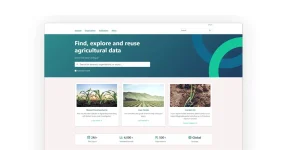
Search and discovery
Search and discovery is one of the most important of these. Many users come to the portal looking for something specific, so a strong search experience is vital. Smart filtering and sorting options, and things like advanced search functionality, autocomplete, or suggestions to guide users are important. Word embeddings can also help users find relevant data, even if they use different terms.
In short, we try to make the interface helpful, intuitive, and engaging, so users can not only complete their tasks, but also discover new possibilities on the portal they didn’t know about. Important design features to help with this might might include:
Dataset exploration
Once users locate a dataset, they should be able to quickly understand what it contains. That means clean metadata layout, data previews, file formats, license info, and visual summaries like charts or maps when possible.
The download process
This should be clear, fast, and flexible. That means showing the available file formats and offering different options, i.e., downloading the one file or just a filtered view. If the file is large, users appreciate seeing the file size or an estimated download time. It is also important to show a confirmation message or progress indicator, so users know the download has started successfully.
Data publishing
For contributors, uploading data should be clear and needs little guidance. This can be made easier with step-by-step forms, tooltips, and validation messages that explain what’s missing or incorrect.
Collaboration
Can users discuss datasets, give feedback, sharing, suggest corrections, rate quality, or ask for additional data? Some portals allow users or groups to create shared pages or dashboards. Supporting this journey means adding features like comments, version history, user roles, or notifications. These tools help build trust and turn the portal into a more active, connected space.
Advanced features
A big part of the UX experience is revealing advanced features that users often don’t know exist. For example, how to help users trace a topic they are interested in and get notifications when new data is published, allow them to create dashboards and visualisations, explore data and compare results using different map layers, and publish large amounts of data with advanced tools.
Data visualization
A customisable chart or datasets presented on a map can help users explore, compare data, export or share results. This way, users don’t just find raw datasets, they can also explore themed dashboards in real time, get insights, and better understand the data. This is something we have looked at in more detail in other posts on our site.
Are you keen to take the user experience of your open data portal to the next level?
Contact us and one of our experts will be in touch.
More articles
- Planning your data infrastructure? The benefits of open source compared to proprietary software
- From proprietary to open source: A New Zealand government agency’s journey with CKAN
- What is the future of open data in the AI era?
- Making data portals user-friendly: a conversation with a UI/UX expert
- Ask AI: Link Digital’s AI layer for smarter CKAN portals