This blog post was co-authored by Adrià Mercader and Sergey Motornyk, Senior Solutions Architects at Link Digital
Interviews with the experts
An open data portal powered by CKAN – the Comprehensive Knowledge Archive Network – can streamline and improve your data collection and publishing and empower users by producing better quality data and more trustworthy analysis. But a key challenge facing many data managers is how to more effectively move data off their portal and into the hands of those who can use it, especially non-expert audiences.
A recent series of interviews with data managers featured on Link Digital’s site highlighted one way of making a portal’s data more accessible: creating visually engaging stories and other accessible knowledge products.
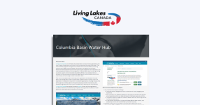
For Claire Herbert, Head of Digital Strategy at the Canadian Watershed Information Network (CanWIN), a vital task is trying to get out facts about freshwater science in a way that is understandable to the public and tells a story about a relevant topic.
In 2020, Link Digital updated the CanWIN site to help researchers better tackle the complexity of the data on freshwater they were collecting. According to Herbert, the next stage in the portal’s evolution is getting the data out to the local communities CanWIN works with, which involves simplifying access and making it more understandable and accessible for non-expert audiences.
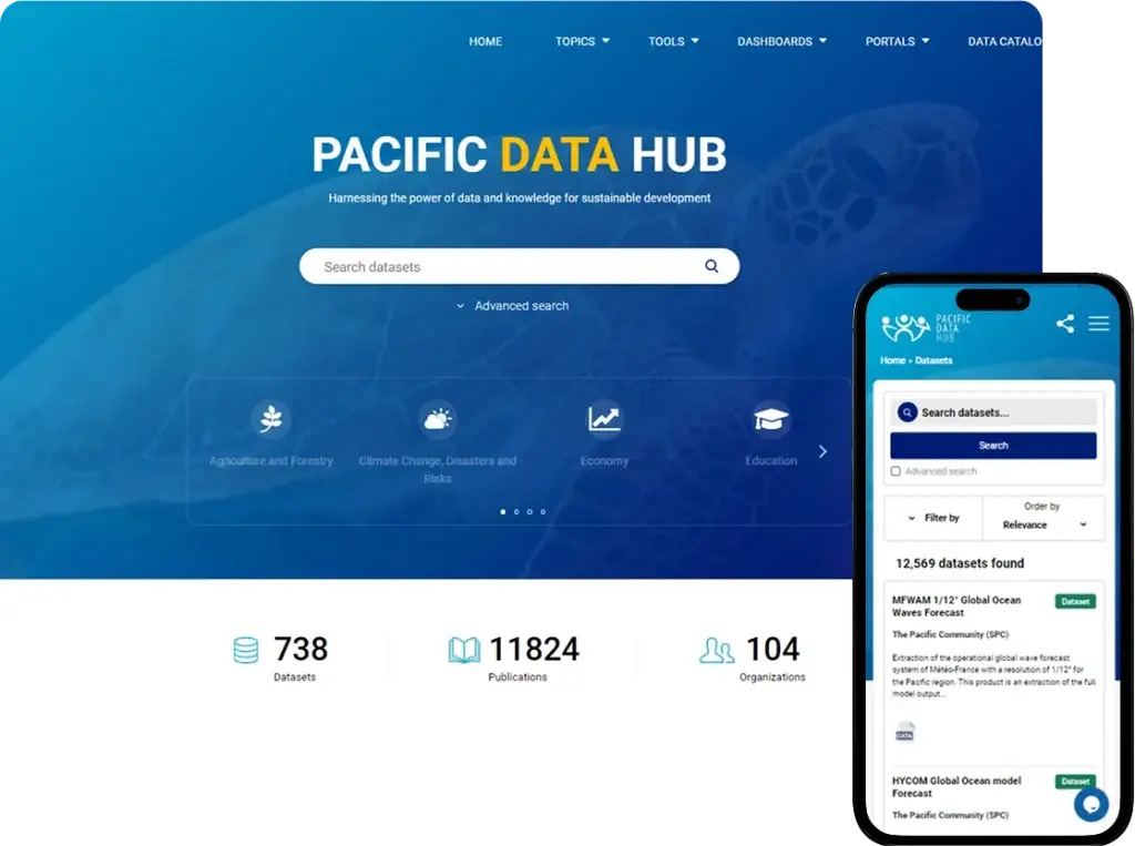
A similar sentiment was expressed by Malcolm Fraser, Programme Manager of the Pacific Data Hub, an open data portal that serves as a gateway to the most comprehensive data collection relevant to the 22 Pacific Island nations.
Data has no value sitting on a hard drive. It has plenty of value when it is being moved around and helping to do things like informing decision-making. So, it is all about empowering people to get their hands on it.
But how can you make more engaging stories out of the datasets on your portal?
CKAN: a powerful storytelling engine
The basic functionality of CKAN is your starting point. Because you need to understand the data you have, ensure its quality and make it discoverable as the first step to presenting it in a more engaging way. CKAN gives you the ability to store, catalogue and share data externally. CKAN’s powerful metadata capabilities not only allow users to host and share the data that they collect, but to standardise it into common language terms that everyone can understand.
Let’s take the CKAN-powered CanWIN open data portal, managed by the University of Manitoba’s Centre for Earth Observation Science (CEOS), as an example. A leading multidisciplinary and collaborative research centre focused on understanding how the earth will respond to climate change, CEOS conducts fieldwork globally, with the Arctic freshwater marine system a particular focus. The ability to develop consistent, standardised metadata schemas enables CEOS researchers to understand the type of data they are collecting and how it was collected, including what instruments were used to collect it. They were also able to create a common data dictionary that researchers working across the globe can use when comparing and discussing data. In other words, they have a common language to understand the data, before they ever collected their first data point, which is vital to re-using the data and turning it into research and other data products.
But CKAN is also highly customisable through a wide variety of extensions that vastly increase the software’s out-of-the-box functionality and seamlessly integrate it with a user’s existing data and digital operations.
This includes extensions to help you to make compelling stories out of the data within a CKAN portal, by combining visualizations with explanatory text and interactive elements. These can bring high value data sets to life and make viewing them a less static and more narratively engaging experience, whether you are talking about climate change, freshwater conservation, international development, education, or whatever.
CKAN extensions for geospatial data
From a technical point of view, extensions are the Python programming language packages that one installs in a CKAN site. Each extension provides one or more plugins that extend or modify CKAN’s basic default behaviour.
There are numerous CKAN extensions related to the visual presentation and exploration of geospatial data, i.e., displaying the data or the spatial extent of the data on a map. One of these, ckanext-geoview, contains plugins that helps improve the accessibility and understandability of geospatial datasets in CKAN portals, improving a portal’s geospatial search and metadata harvesting functions, and the ability to render and visualise common geospatial data formats including GeoJSON, ArcGIS Rest, API endpoints, and Web Map Service in various map form for users.
Another key extension, ckanext-spatial, helps CKAN understand a location associated with a dataset, for instance, a pair of coordinates, a bounding box for the dataset extent, or an arbitrary polygon. These geometries are then indexed, allowing users to perform spatial searches for datasets that fall within an area of interest. This extension also includes harvesters that allow for the importation of common geospatial metadata formats, making them discoverable as CKAN datasets.
Together, ckanext-geoview and ckanext-spatial are the most used extensions in Link Digital’s geospatial data related toolbox. Both are easy to install and designed to integrate seamlessly with the user’s existing data tooling.
Extensions to create interactive data experiences
Another useful extension to improve data visualisation within a CKAN powered portal is ckanext-charts. This was initially developed by Link Digital during our work on an internal data portal for the international medical NGO, Médecins Sans Frontières/Doctors Without Borders. MSF were keen to get a better sense of how many datasets they had and in what stages of processing they were in at any given time.
The extension enables data managers to create more dynamic visualisations to enhance data interaction and presentation by creating, editing, embedding and sharing interactive charts directly from tabular datasets stored in CKAN. You can select the best chart type that fits your data – line, bar, scatter, pie charts, etc – and enables their presentation in customisable colours. It allows users to better visualise time series, categorical, or proportional data. In MSF’s case, the extension helped achieve greater workflow visualisation – the various stages of verification and approval that datasets went through before being uploaded to its internal data portal.
The ckanext-blocksmith is a powerful page-building extension for CKAN, developed by Cherniavskyi Oleksandr at Link Digital. Built entirely on the GrapesJS – a free and open source web building framework – it brings drag-and-drop visual editing capabilities directly into the CKAN ecosystem. With it, users can design rich, custom pages composed of modular content blocks, without writing code. Each block can include elements like text, images, embedded videos, HTML components, forms, sliders, or previews generated by other CKAN extensions such as ckanext-geoview or ckanext-spatial. Ckanext-blocksmith combines flexibility with ease of use, enabling non-developers to create visually engaging, data-driven pages that better communicate the value and context of published datasets. Currently in the final stages of development and testing, ckanext-blocksmith will empower users to build richer, data-driven pages—without needing developer assistance.
Dashboards: another level of interactivity with data
But even with their added functionality, the extensions mentioned so far can only visualise data uploaded into CKAN. For those wanting to visualise datasets external to CKAN, a popular solution is dashboards. Dashboards can display datasets dynamically, helping to organise visualisations and narrative elements for storytelling, and they are easy to add to an existing site without having to create any new interface.
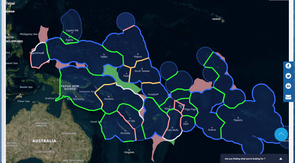
One example of an effective dashboard is the Maritime Boundaries site, hosted by the Pacific Data Hub. Built by Link Digital, the dashboard is designed to share relevant information on Pacific Island maritime boundaries and zones, based on information held by the United Nations with support from the Pacific Maritime Boundaries Consortium of Partners and through the Pacific Maritime Boundaries Program. It enables users to click on a particular boundary and view information and datasets associated with the country or territory concerned. The dashboard also contains information about how maritime boundaries are formed.
There are a range of dashboard tools that can be easily integrated with CKAN to deliver a more visual, interactive experience. One of the most popular is Microsoft Power BI. Using built-in open source visuals, the platform enables users to create their own visualisation experiences out of different sources of raw data, including those stored in CKAN. Power BI can be integrated easily into CKAN using the extension ckanext-power-bi. A completely open source application that has a similar functionality is Leaflet, an easy to use JavaScript library for building interactive maps. Link Digital used Leaflet to build the Maritime Boundaries site mentioned above.
If you want to know more about how different data managers are rising to the challenge of making their data more accessible, you can read my interview with CanWIN’s Claire Herbert, here. My interview with Malcolm Fraser, Programme Manager of the Pacific Data Hub, is available here.
Let’s work on your data project
Are you interested in crafting more visually engaging stories using the data from your portal? Reach out today.